
Color Theory for Quilters: How to Choose a Winning Palette
Choosing fabrics for your quilt can feel overwhelming, but understanding color theory makes the process easier. The color wheel, value contrast, and color schemes like analogous or complementary palettes help you create designs that stand out. Warm colors add energy, cool tones provide calm, and neutrals balance everything.
This guide covers the basics of color theory, explains practical color schemes, and offers tips for matching fabric colors. Whether you’re going for bold contrast or a soft, blended look, these principles will help you craft a quilt that looks polished and balanced.
Let’s dive into the steps for building a color palette that works beautifully.
Color Theory Basics for Quilters
Before diving into fabric selection, it’s helpful to grasp a few color theory essentials and choose quilting techniques that make your project feel purposeful rather than random. Concepts like the color wheel, hue variations, and value contrast provide a solid foundation for creating harmonious palettes. By understanding these principles, you can bring more depth and intention to your quilt designs. Let’s start with the color wheel and its role in quilting.
How the Color Wheel Guides Quilters
The color wheel is a handy visual tool that organizes 12 basic hues into a circle, showing their relationships. These hues include primary colors (red, yellow, blue), secondary colors (orange, green, purple), and tertiary colors, which are blends between them. Quilters often use geometric relationships on the wheel to craft balanced color schemes. For example:
- Analogous palettes: Combine three colors next to each other on the wheel for a soft, blended effect.
- Complementary palettes: Pair colors directly opposite each other for bold, high-contrast designs.
The wheel also divides into warm colors (reds, oranges, yellows) that seem to "pop" or come forward, and cool colors (blues, greens, purples) that appear to recede. This warm-versus-cool contrast helps you decide which fabrics should take center stage and which should play a supporting role in your quilt.
Hue, Tint, Shade, and Tone in Fabric Choices
Knowing how colors shift when mixed with white, black, or gray can add depth to your quilts. Here’s a quick breakdown:
- Hue: The pure color, as seen on the color wheel (like red or yellow).
- Tint: A hue mixed with white, creating a lighter, pastel version.
- Shade: A hue mixed with black, producing a darker, richer version.
- Tone: A hue mixed with gray, resulting in a muted, more subdued color.
Pure hues are bold and attention-grabbing, while tones add a subtle sophistication. Using a mix of tints, shades, and tones within the same hue can create a palette that feels cohesive yet visually dynamic.
The Importance of Value in Quilt Design
Value - the lightness or darkness of a color - often has a bigger impact on your quilt’s overall look than the colors themselves. Without enough variation in value, your quilt might appear flat or lack definition, making it hard for block shapes to stand out. A successful quilt usually includes a mix of light, medium, and dark values to create depth and dimension.
Here are some simple ways to check value contrast:
- Squint test: Squint at your fabric choices to blur the details. The fabrics that still stand out are your dominant values, while those that blend together have similar values.
- Black-and-white photo test: Take a photo of your fabrics and convert it to black and white. If the fabrics look like the same shade of gray, you’ll need to add more contrast.
Keep in mind that value is relative. A fabric that seems light in one group might act as a medium when paired with even lighter fabrics. Always evaluate your fabric selections together to ensure the right balance of values.
sbb-itb-907b860
Common Color Schemes for Quilts
Once you've got a handle on the basics of the color wheel and how values work, it's time to put that knowledge to use. Practical color schemes can simplify fabric selection, giving your quilts a polished and harmonious look. Let’s dive into three popular approaches - analogous, complementary, and monochromatic - and how you can use them to craft quilts that stand out.
Analogous Color Schemes
Analogous color schemes use hues that sit next to each other on the color wheel, creating a naturally pleasing harmony. To make this work, pick one dominant color and pair it with one or two neighboring shades for a subtle contrast. For example, you might choose blue as your main color and pair it with blue-green and green accents.
Balance is key here. Avoid splitting the colors evenly across your quilt. Instead, let one color take center stage while the others act as supporting players. To add depth, work with a range of values - lighter tones closer to yellow and darker ones leaning toward violet. Mixing print scales also helps keep things interesting. Pair bold florals with smaller geometric patterns to avoid a flat or monotonous look.
Complementary Color Schemes
Complementary colors are opposites on the color wheel, like red and green, blue and orange, or yellow and purple. These combinations create bold, high-contrast quilts that grab attention with their vibrant energy. But because they pack such a punch, they need to be used thoughtfully.
Start by choosing one color as your dominant shade and use its complement sparingly for accents. For example, a blue quilt with orange highlights can be striking without feeling overwhelming. To soften the intensity, experiment with different values of each color instead of sticking to their brightest versions. Adding a neutral background - think white, gray, or beige - can also provide balance and give the eye a place to rest.
Monochromatic Color Schemes
Monochromatic quilts focus on a single hue, but they achieve variety by playing with tints, shades, and tones. This approach results in quilts that feel refined and calming, with an understated elegance.
To make a monochromatic palette work, include a wide range of values, from very light to very dark. Without this contrast, the design can feel flat or muddy. For added depth, combine vibrant, saturated fabrics with more muted ones. Many modern quilters use this technique to create ombre effects, where the colors fade smoothly from light to dark across the quilt. It’s a simple yet striking way to showcase the beauty of a single color family.
Warm, Cool, and Neutral Colors in Quilting
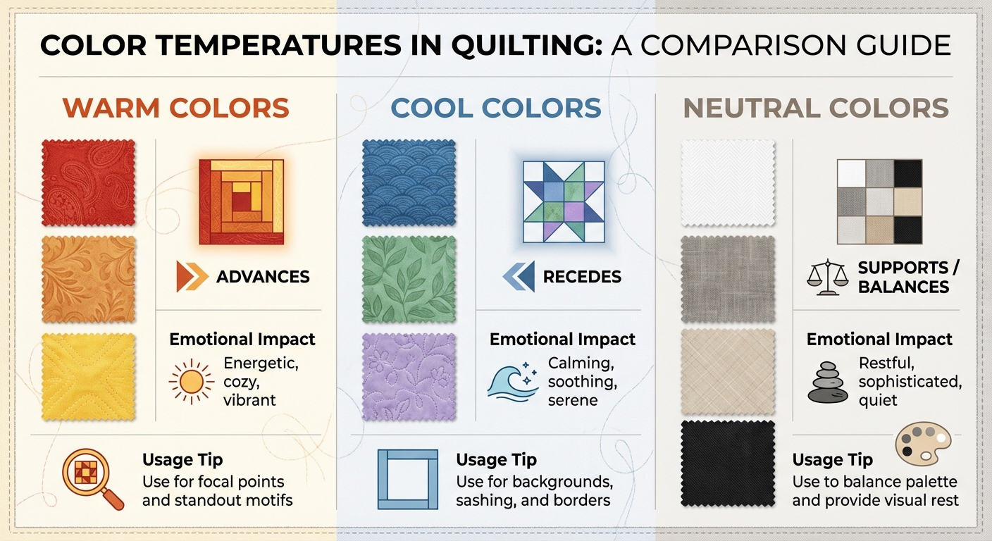
Warm, Cool, and Neutral Colors Guide for Quilters
Building on the earlier discussion of color relationships and value, let’s dive into how color temperature can refine your quilt design. If you're just starting your quilting journey, understanding these basics is key. Color temperature - whether a hue is warm, cool, or neutral - plays a big role in how colors interact and guide the viewer’s eye. These categories not only evoke certain feelings but also influence how colors visually behave in your quilt. Warm tones seem to move forward, cool tones recede, and neutrals provide a steady balance. By understanding these dynamics, you can control how the eye navigates your design.
| Color Category | Common Hues | Visual Effect | Emotional Impact |
|---|---|---|---|
| Warm | Red, Orange, Yellow | Advances | Energetic, cozy, vibrant |
| Cool | Blue, Green, Purple | Recedes | Calming, soothing, serene |
| Neutral | White, Gray, Beige, Black | Supports / Balances | Restful, sophisticated, quiet |
Here’s how warm, cool, and neutral tones influence a quilt’s overall look and feel.
Using Warm Colors for Focal Points
Warm colors - reds, oranges, and yellows - naturally grab attention, making them ideal for focal blocks or standout motifs. For instance, a feathered star or appliqué design will pop when created with warm fabrics. Yellow, in particular, is the most attention-grabbing pure color, so even a small amount can make a big impact. Think of warm tones as your quilt’s visual anchors - they guide the viewer’s eye and bring energy to your design.
Using Cool Colors for Backgrounds and Borders
Cool colors like blues, greens, and purples work beautifully as backgrounds, sashing, or borders. Their receding quality creates depth and helps highlight warmer focal areas. Pairing a warm centerpiece with a cool background can give your quilt a three-dimensional effect. For a calming, cohesive look, consider using blues and greens more broadly across your design.
How Neutrals Balance Your Palette
Neutrals - such as whites, grays, beiges, and sometimes blacks or navies - are vital for balancing your quilt’s palette. They support brighter colors, letting them shine without competing for attention. Neutrals also provide a resting place for the eye, which is especially helpful in quilts with bold or busy patterns. Low-volume prints, featuring subtle designs on light backgrounds, are a great way to soften strong palettes and give your quilt a refined, polished feel. However, keep in mind that stark white or deep black can sometimes stand out, depending on the surrounding colors, so it’s worth testing your fabric combinations before finalizing your choices.
How to Choose Your Quilt Palette
Selecting the perfect palette for your quilt can transform your design into something truly special. By building on quilting terms and basic color theory, you can follow these steps to create a color scheme that brings your vision to life.
Step 1: Think About Your Quilt's Purpose
Start by considering the quilt's purpose. Is it meant to be a cozy addition to your living room, a playful baby quilt, or a bold decorative piece for a guest room? The intended use will guide your color choices. For instance, soft pastels or bright, cheerful tones work wonderfully for a baby quilt, while a modern wall hanging might thrive on striking, high-contrast colors. Also, take note of the lighting in the quilt's future home. Natural daylight reveals colors most accurately, but artificial lighting can alter their appearance. Testing your fabric in that specific space ensures your palette will look just right.
Step 2: Choose a Starting Color
Every great quilt palette begins with a single inspiring color or fabric. You might find this in a bold floral print, a geometric pattern, or even a favorite fabric bundle from Mrs. Quilty’s curated collections, which are pre-designed for color harmony. If you prefer to start from scratch, use the color wheel to create an analogous or complementary scheme. Inspiration can also come from nature, seasonal changes, or even a trip to the hardware store for paint swatches. Whatever you choose, make sure it excites you and captures the mood you’re aiming for - whether it’s calming blues, joyful yellows, or energetic reds. Once you’ve picked your starting color, you’re ready to build the rest of your palette.
Step 3: Build and Test Your Palette
With your starting color in hand, begin adding fabrics that vary in value - light, medium, and dark tones. Combine large prints with smaller, more subtle patterns to create depth and interest. Lay out your fabrics on a design wall or table, then step back to evaluate them from a distance. To ensure your palette has enough contrast, try squinting at the fabrics or snapping a monochrome photo. This will help you confirm that your values work well together. Don’t forget to include neutrals to balance the overall look.
Step 4: Finalize Your Fabric Choices
Decide the role each fabric will play in your quilt - background, main, or accent - based on its value and visual impact. If you’re working with complementary colors, use them in unequal amounts to avoid overwhelming the design. For example, let one color dominate while the other acts as a subtle accent. Once you’ve finalized these roles, the cutting and piecing process will flow much more smoothly.
Mrs. Quilty's Curated Fabric Bundles
Choosing the right fabrics for a quilt can feel like a daunting task, but Mrs. Quilty's curated fabric bundles make it easier than ever. These handpicked collections are thoughtfully designed using principles of color theory - like analogous schemes and complementary palettes - to ensure your quilt has the perfect balance of harmony and contrast. The bundles are crafted by experts who understand how colors work together, saving you the guesswork.
Each bundle includes a mix of light, medium, and dark values, creating depth and dimension in your quilt. They also blend warm tones, which naturally catch the eye, with cool tones that provide a sense of calm. This thoughtful combination gives your quilt a professional, polished appearance while sparing you the trial-and-error process of coordinating fabrics yourself.
You can use a curated bundle as your entire color palette or as a starting point to build upon with fabrics from your own collection. This method is especially helpful if you're trying out new color schemes or stepping outside your usual preferences. Adding a few personal touches to the professionally coordinated base allows you to maintain balance while still creating something uniquely yours. Just make sure the fabrics you add enhance the contrast and visual interest of the overall design.
When your bundle arrives, lay out the fabrics to assess their contrast and values. Look for a mix of high-saturation colors - those bright and bold tones - and low-saturation shades that are softer and more muted. This balance ensures your quilt has a sophisticated look that’s neither too overwhelming nor too flat.
Whether you prefer subtle monochromatic schemes or bold complementary contrasts, Mrs. Quilty's curated bundles take the stress out of fabric selection. With these expertly coordinated collections, you can skip the hassle of matching hues and dive straight into the fun part: cutting, piecing, and bringing your quilt to life.
Conclusion
Dive into color theory with a mix of curiosity and confidence. Start by exploring how different hues relate to one another and influence your designs.
To put these ideas into action, pick a color you love and build your palette around it using either analogous or complementary schemes. Take a moment to evaluate your palette, ensuring it balances light and dark tones.
Feeling uncertain about your choices? Mrs. Quilty's curated fabric bundles are a great place to start. These collections are thoughtfully designed with balanced tones and harmonious color pairings. You can use them as they are or mix in pieces from your own fabric stash to make them uniquely yours. This method aligns perfectly with the strategies we've discussed for crafting stunning quilt designs.
FAQs
How do I choose the perfect starting color for my quilt palette?
Start by picking a fabric that immediately grabs your attention - this will be your anchor color. Locate its hue on a 12-color wheel (primary, secondary, or tertiary) to set the tone for your entire palette. Are you leaning toward warm tones like reds, oranges, and yellows for a cozy vibe? Or do cool tones like blues, greens, and purples feel more inviting for a tranquil look? Your anchor color will likely play a starring role in your quilt's top, backing, or binding.
Next, choose supporting colors using one of these simple color schemes:
- Analogous: Select colors that sit next to your anchor on the wheel for a seamless, harmonious effect.
- Complementary: Pick colors directly opposite your anchor for a bold, striking contrast.
- Monochromatic: Stick with tints and shades of the same hue to add subtle depth and texture.
Lay out all your chosen fabrics on a flat surface to see how they interact. This step helps you visualize the final look and ensures everything blends beautifully. If you’re unsure about matching fabrics, Mrs. Quilty’s expertly curated bundles can save the day. These bundles include pre-matched accent fabrics that showcase these color schemes effortlessly. With a carefully chosen anchor and thoughtful accents, you’ll craft a quilt palette that’s both balanced and eye-catching.
How can I balance warm and cool colors when designing a quilt?
To design a quilt with a harmonious look, let warm colors take center stage, using cool colors sparingly as accents or in neutral fabrics to soften the overall contrast. A color wheel can be a helpful tool here - look for complementary or analogous shades to create a natural balance between warm and cool tones. This method helps your quilt maintain a unified and eye-catching appearance while still offering a lively variety of colors.
How can I use value contrast to make my quilt design stand out?
Value contrast plays a vital role in crafting quilts that stand out. By blending light, medium, and dark fabrics, you can bring depth and richness to your design. Pairing light fabrics with dark ones creates a bold, eye-catching effect, while medium tones act as a bridge, ensuring a smooth and harmonious flow throughout the quilt.
To achieve a refined finish, try using high-contrast combinations for striking focal points. For areas where a gentler look is desired, opt for softer contrasts. This balance ensures your quilt remains visually engaging without feeling overpowering.